.JPG: PRINTSHOP AND ARTIST COMMUNITY
Considering the specifics of the platform — that it will be used by a wide range of artists with different visual languages — the approach was to keep the UI as simple as possible. The goal was to let the works speak for themselves. Every decision in the design system was built on this foundation. Neutral colors and a flexible layout grid avoid imposing a visual tone, while bold, modern headlines add structure and identity without overpowering the content.


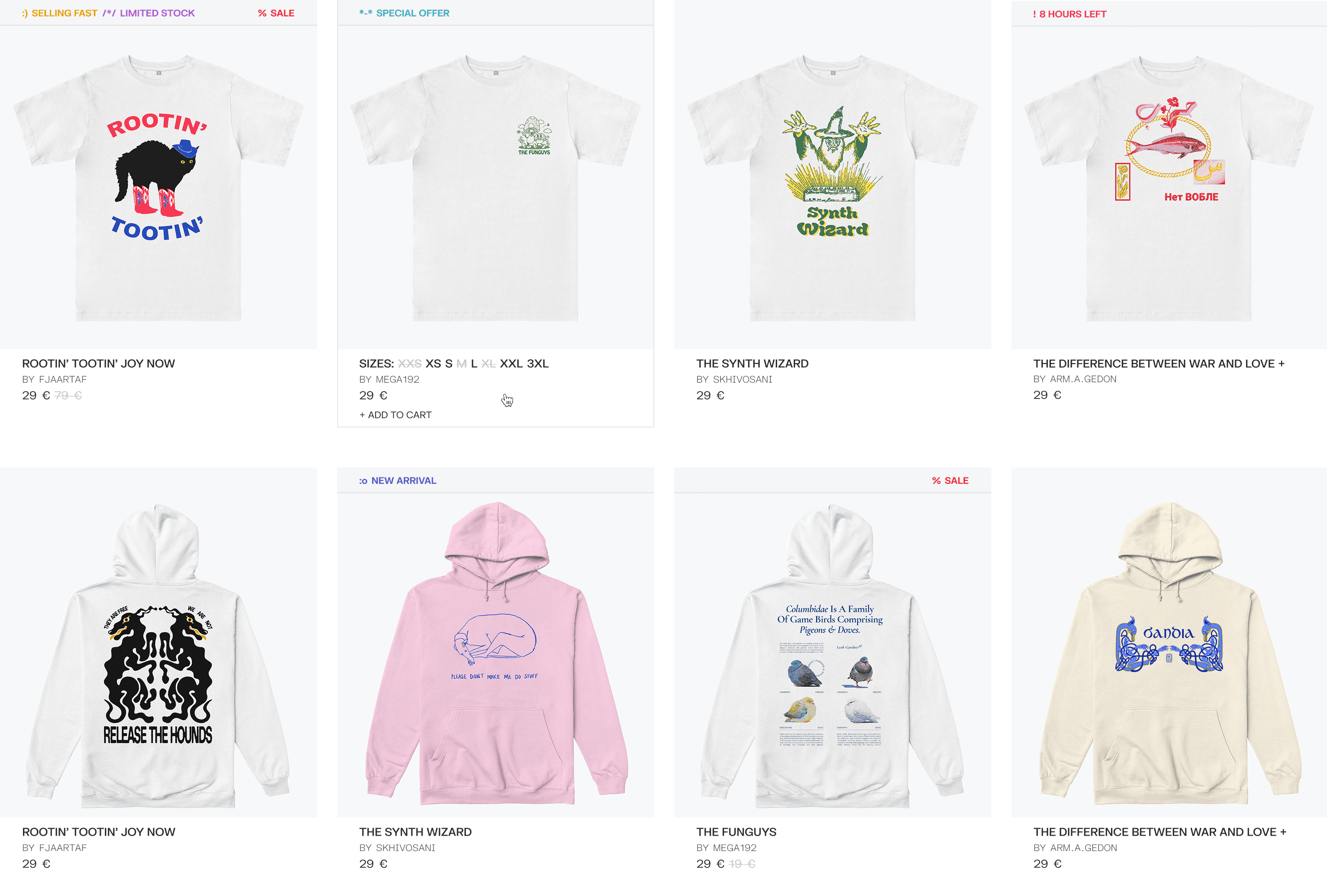
The approach was to keep the structure clean and quiet, with clear visual separation between image, info, and interaction. All functional layers — price, stock status, sizing, and cart actions — are accessible without opening a new page.

Special tags like “Selling Fast,” “Limited Stock,” and “Special Offer” add a secondary layer of urgency or attention, but they stay light. Color-coded and positioned consistently, they help guide the eye without breaking the layout. These badges bring subtle movement and tone into an otherwise neutral system — without overwhelming the product image or hierarchy.


The cart overlay was designed to stay on top of the page, keeping the user anchored in context. It avoids full-page interruption, acting more like a tool than a detour. Product info, pricing, size, color, time limits, and actions like remove or move-to-favorites are all accessible in one view. Visual hierarchy is defined by spacing and type weight — no added decoration.


